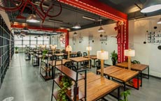
本案是一二三设计为AZZO打造的置入了花艺元素的社区店,旨在为城市生活中的人们提供便捷的精品咖啡,又能在店里享受慢节奏的时光。
东仓建设张星:香港COCO办公室
傅厚民:香港奕居精品酒店设计
梁志天:北京富力湾湖心岛别墅项目A2户型
李冰冰、黄晓明、任泉合营火锅店热辣一号设计方案
Work8众创空间——最具颠覆性的办公空间设计

中国独立设计师的原创家具品牌大搜罗
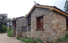
孙君:广水市桃源村乡村景观改造 古村落浴火重生
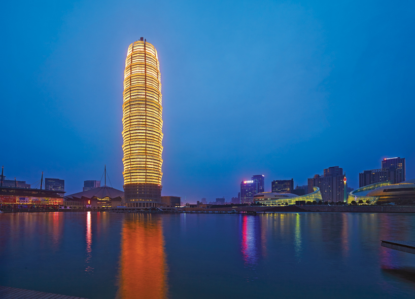
大玉米棒子?60层高新地标绽放郑州!
水平线最新力作:画屏——北京居然顶层琚宾之家
罗灵杰、龙慧祺设计作品:南昌新华银兴国际影城
.jpg")
.jpg")
.jpg")
.jpg")
.jpg")
.jpg")
.jpg")
.jpg")
.jpg")
.jpg")
.jpg")
.jpg")
.jpg")
.jpg")
.jpg")
.jpg")
.jpg")
.jpg")
.jpg")
.jpg")
.jpg")
.jpg")
.jpg")
.jpg")
.jpg")
.jpg")
.jpg")
.jpg")
.jpg")
.jpg")
.jpg")
.jpg")
.jpg")

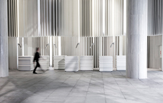
*在城市生活中的人们,一觉醒来后总有让自己变得急促起来的各样事情,因此在忙碌过后,我们也会不自觉地去寻找让自己慢下来的空间。本案是一二三设计为AZZO打造的置入了花艺元素的社区店,旨在为城市生活中的人们提供便捷的精品咖啡,又能在店里享受慢节奏的时光。
City dwellers are hustle and bustle at the time when they wake up. They will therefore unconsciously find the time to slow down after solving the chaos. In this project, a neighborhood shop with floral accents made for AZZO, aims to make urban dwellers access to a quaint coffee shop and enjoy themselves in the shop.
*为此,本店选址在某住宅区下的临街商铺,由三卡连通而成且在转角处。为突出5.2米的高屋檐特点,设计师将原有繁复的装饰元素去除,以简练的线条重新勾勒空间框架。浅灰调水泥表面让梁柱回归到更原始自然的状态,大面积可开合的门窗让室内外空间自然流淌,营造了视野开阔,轻松自在的情景。
To that end, the shop is situated beneath a street shop in the corner, by three cards joined. The designer eliminates the original intricate decorative components and redraw the space frame with straightforward lines to accentuate the 5.2-meter-high eaves. As for the beams and columns, the designer takes on a more basic and natural appearance due to the light gray cement surface. It is possible to open and close a sizable number of doors and windows, which allows the interior and exterior areas to flow together naturally and produce a calm and spacious environment.
▲不同光影下的门面招牌
*AZZO在广东中山已植根数载,积累了一定的认知度,但从本店开始AZZO希望以全新的空间面貌呈现。所以在展开设计前,设计师与AZZO讨论最多的是新门店应该长什么样子。是追随当下的某种风潮?是来自顾客们的反馈?还是从品牌方的偏好或设计师的主导?
AZZO enjoys a long history in Zhongshan, Guangdong Province, gaining reputation at there. However, AZZO intends to project a fresh spatial identity from this store. Therefore, the most crucial conversation with AZZO before the design was about the new store's design. Does it adhere to the trends of the day? Is it responses from clients? Is it the supremacy of the designer or the preference of the brand side?
▲咖啡区入口正面视觉
*经一番探讨后(一个下午),我们得出了以“相由心生”为设计的出发点。设计师从AZZO的品牌形象特征中发掘一种视觉语言,贯穿到空间的设计中,以无声的方式传达AZZO的咖啡理念与独有的空间体验。
After hot discussion (one afternoon), we arrived to "the face is the index of the heart" design's foundation. In order to transmit the coffee concept and distinctive space experience of AZZO in a silent manner, the designer experiments with a visual language from the brand image of AZZO.
"A"
*门头招牌以“A”字母的斜线特征为原形,并借鉴了中国古建筑的牌匾形式设计,向店内倾斜,形成与顾客自然对望的角度,消除了大体积招牌带来的压抑感。在远处的游人或是行驶中的车流也能注意到咖啡与花艺的信息和两者在空间中的位置关系。
The storefront signboard, which had the letter "A" in a diagonal pattern and is modeled after a plaque in ancient Chinese architecture, is angled toward the store and forms a natural angle with the clients, doing away with the oppressive feeling that the sign's vast size would otherwise have. Visitors or distant moving drivers may also notice the information about coffee and flowers, as well as their spatial relationship.
"Z"
*咖啡吧台以Z字形的方式布局,以点单区和产品展示区为中心,向外延伸至入口处的快提区,向内则转折至手冲咖啡区,再直线延伸至相邻的花艺服务台,形式了整个店空间的服务动线。
The coffee bar is set up in a zigzag style with the order area and product display area in the middle. From there, the moving line for the entire store extends straight ahead to the nearby flower service desk after curving inward to the hand-made coffee area.
▲以Z字母变化而成的脉搏跳动符号
*咖啡吧台的主背景由手工砖铺砌而成,每块砖都有着略为不同的差异,有如咖啡豆,每颗都看似相同,但正因为这种细微的差异造就了咖啡丰富的口感变化。
Similar to coffee beans, which appear identical but differ subtly, the main background of the coffee bar is built of handcrafted bricks. It is exactly because of these minute differences that the rich flavor of the coffee differs.
"O"
*宽2.2米的玻璃旋转门设计,打开了更有趣的进店方式,既能方便手推婴儿车的顾客进入又为布置较大型的花艺和日常咖啡耗材的进出提供了便捷性。O型的座椅坐落于咖啡区的中心位置,适配不同的客人就坐或等候,中间的花艺会随时节的变化而更换,也起到了柔化空间氛围和变换情景的作用。
By opening the 2.2-metre-wide glass revolving door design, we find more join here, and customers who are using strollers as well as those looking for larger floral arrangements and daily coffee supplies now have a more exciting approach to enter the store. The middle of the coffee area has O-shaped seats that may accommodate various people to sit. As the seasons change, the flower design in the center will also vary, thus relaxing the ambience of the room and altering the scene.
*在客坐区,面向街道的玻璃折叠门,在天气怡人时为敞开的状态,在此就坐的客人与街道穿行的车流形成了快与慢的对比。
When the weather is nice, it’s a good choice to open the glass door, allowing the fast and slow movement of the traffic to be seen.
▲操作间趟门上的符号像是告诉
顾客里面的人正在努力工作
在空间中的不同位置,客人或许会不经意地发现许多由AZZO视觉特征开发的设计细节。这有如人与人的相处方式,互相不必正式的作自我介绍,但随着彼此在一起的时光,会从陌生慢慢变得熟悉。也自然而然地产生情感上的连结。
Visitors may unintentionally come upon numerous design elements created by AZZO Visual Features at various locations throughout the area. This is similar to how people get along with one another—We don't need to formally introduce ourselves, but as we spend time together, we will gradually go from being odd to being familiar. Additionally, it inevitably forges an emotional bond between us.
Project Information
项目名称|就手咖啡
类型|咖啡空间
设计方|一二三设计有限公司
面积 |200平方米
完成年份|2022-01/2022-03
主创设计|刘嘉培
摄影版权|表扬一下
项目地址|中国广东省中山市翰华花园
材料|水曲柳、手工红砖、不锈钢、水泥涂料
About Designer
刘嘉培
2022年创立一二三设计,专注于商业领域空间设计,并涉足公共类空间、艺术装置及家具设计,喜于聆听客户的需求和了解项目背后的故事,以此成为设计创新和让作品充满趣味的源泉。
LINKS
Copyright © 2012 www.cbda.cn All Rights Reserved.
地址:北京市南四环西路128号院诺德中心3号楼1508-1510 邮编:100070
联系电话:010-88114884(北京总部) 0755-23894034(深圳) 传真:010-88114884